Visualize Tracks data with the new Charts
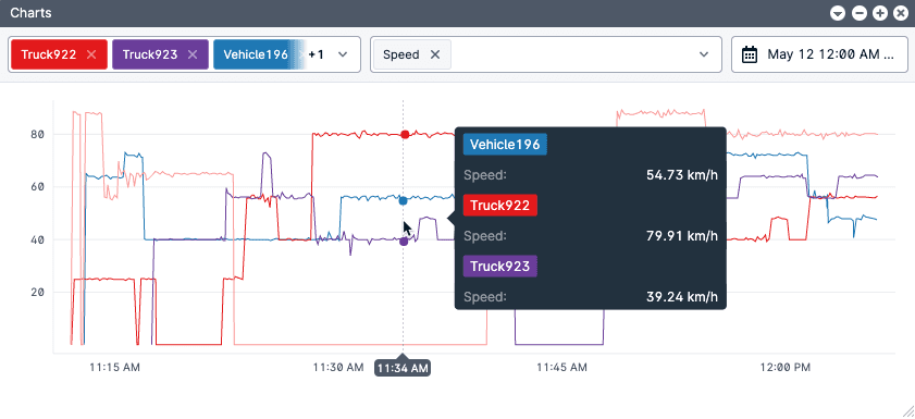
We've added a new way for fleet operators and managers to view fleet track data: Charts. Some data can be hard to analyze when it's simply numbers on a screen. Charts makes it easier by plotting data on a graph for quick analysis and oversight.
Since Tracks data is so crucial for fleet operations, we continue to add new capabilities to Tracks. This month we're making it easier for operators and managers to quickly get an overview of the fleet data they choose.
Charts
Charts plots your selected data on a graph. It allows for improved oversight because it's easy to find outliers and situations that fleet managers may want to address. Managers can choose the data they need to view: dates, vehicles, and ANY variable they'd like.

By making telematics data easier to analyze, fleet managers can work to increase fleet efficiency, save on fuel costs, and improve safety. It is easier to identify excessive idling, lots of speed variance that may indicate inefficient driving, or alerts that might indicate harsh or unsafe driving. Fleet managers get a truer picture of their fleet with Charts.
There are many ways to access the Charts feature that pre-populate the dates, vehicles, and even variables. Click the graph to see individual values in a popup and drag your mouse to move across the timeline with popup data visible. Learn more about using Charts.
Server administration
We've moved more server administration settings in-app so that site administrators can efficiently manage their servers without needing to visit Site Admin each time. Administrator users can now access System Messages, License, and Active Director settings within applications.
Developers
We've also made some additions for developers this month. Updating geofences can now be done with REST API, saving fleet managers with frequent geofence updates lots of administrative time.
More details
For all of the release details, visit the November release notes. For access, update your server to the latest monthly release.