GpsGate Dashboard: elements that transform fleet control
A cornerstone of successful fleet management is analyzing data. Decisions, further actions, and measuring success all rely on having key information readily available. Getting your hands on the right information? Easier said than done. Organizing, visualizing, and sharing key insights can give fleet managers a headache. Enter Dashboard. Your customers’ tailored panel for the insights they need. GpsGate Cloud users can enable this premium feature in the GpsGate Store.

How Dashboard helps share data and save time
Managing time and data are key challenges for fleet managers. Dashboard provides a graphic landing area designed to highlight your customers’ KPIs. Fleet management is not one-size fits all, and neither is Dashboard. Key data from cold chain fleets will differ from taxi fleets, which is why GpsGate’s new premium feature is customizable. Colorful Widgets present data right in the UI, so fleet managers don’t need to dig for details. Drill Down by clicking on a Widget, to flag dangerous driving. Top Lists show drivers who triggered the most speeding events today or in the last week.
What good do key insights do if they can’t be shared? Not much. Once Dashboard is enabled and configured within GpsGate, the feature is visible in the Fleet App, and automated notifications can be sent there too. If a customer wants to share with their team when speeding events in the last hour surpass 100, they can.
Give Dashboard a go! Dashboard is free to try until 1 December 2023.
Collect data with Dashboard Metrics
All this talk of Metrics may have you wondering what they are.
Dashboard Metrics are data sources that can be configured in the feature and generate results. They pull data gathered by event rules that reflect behaviors that your customers need to monitor.
In Dashboard, 4 Metric types can be configured and displayed via Widgets.
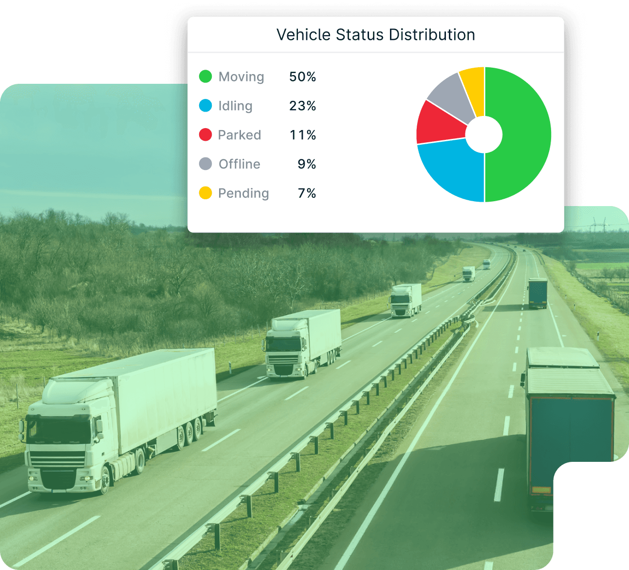
- Vehicle Status Distribution provides a breakdown of time spent moving. If a customer sees vehicles have spent 40% of the last hour parked, it may mean something isn’t right.
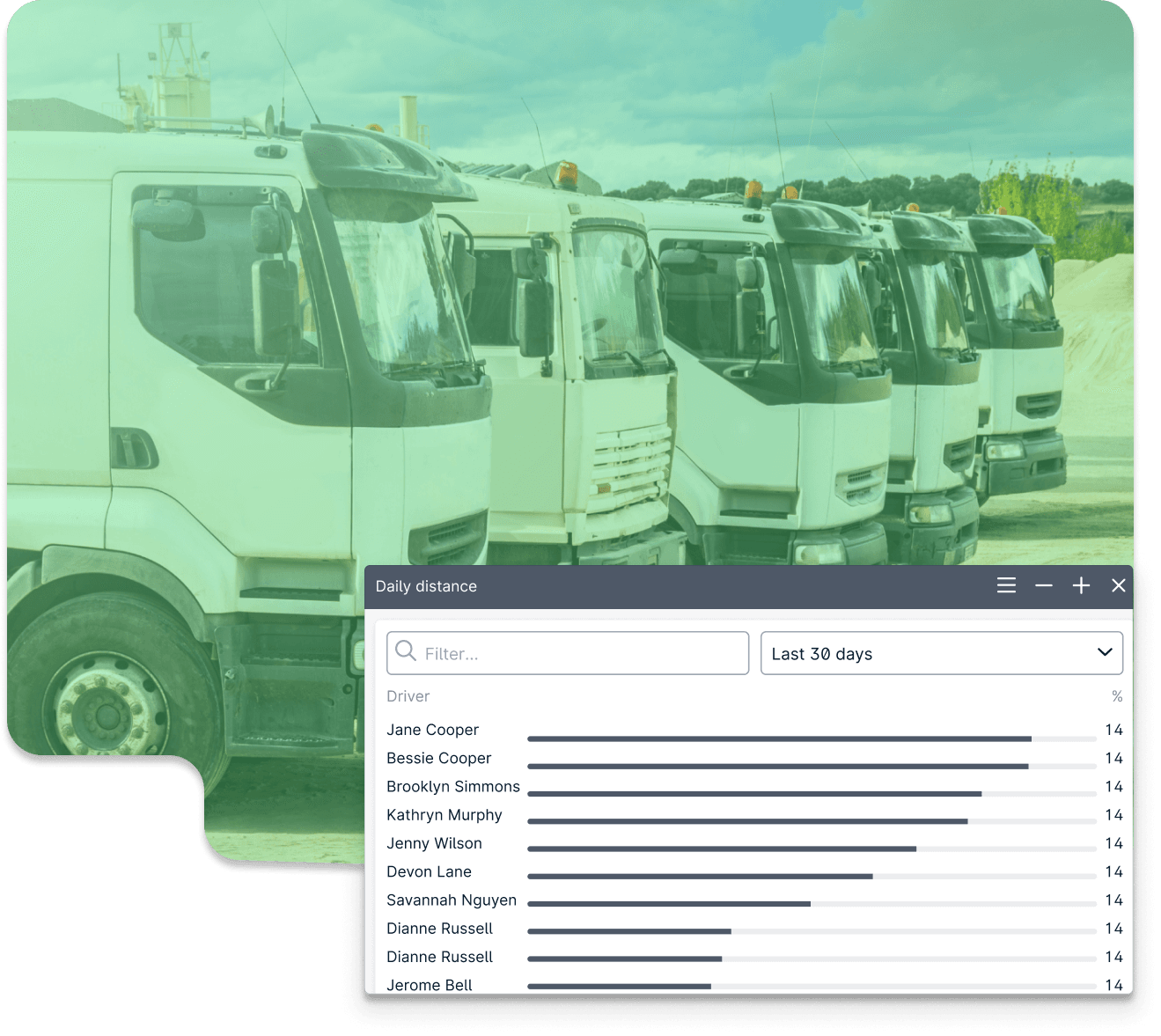
- Total distance reflects the distance vehicles have traveled within a selected time period. Fleet managers can see which vehicles are being pushed too far, and step in to better plan routes.
- Event frequency provides a bird's eye view of the number of times event rules are triggered. Customers can use this Metric to flag drivers who speed frequently.
- Event state distribution tracks the progress of a configured event rule. If vehicles have spent 30% of the last hour in the garage, fleet managers may want to investigate further.
Visualize KPIs with Dashboard Widgets
So, now you know about Metrics, but what are Widgets?
Widgets are graphic elements that exhibit the KPIs pulled by Metrics. They are configurable and appear in the Dashboard panel.
There are 3 Widget types that can be grouped into 2 categories:
- Use pie charts to visualize how much time vehicles have spent moving in the last 24 hours, or what percentage of time vehicles have spent parked in the garage.
- Use histograms and line charts to see how far vehicles have traveled each day in the last week, or how many times drivers have accelerated too harshly.
Dashboard in the palm of your hand with the Fleet app
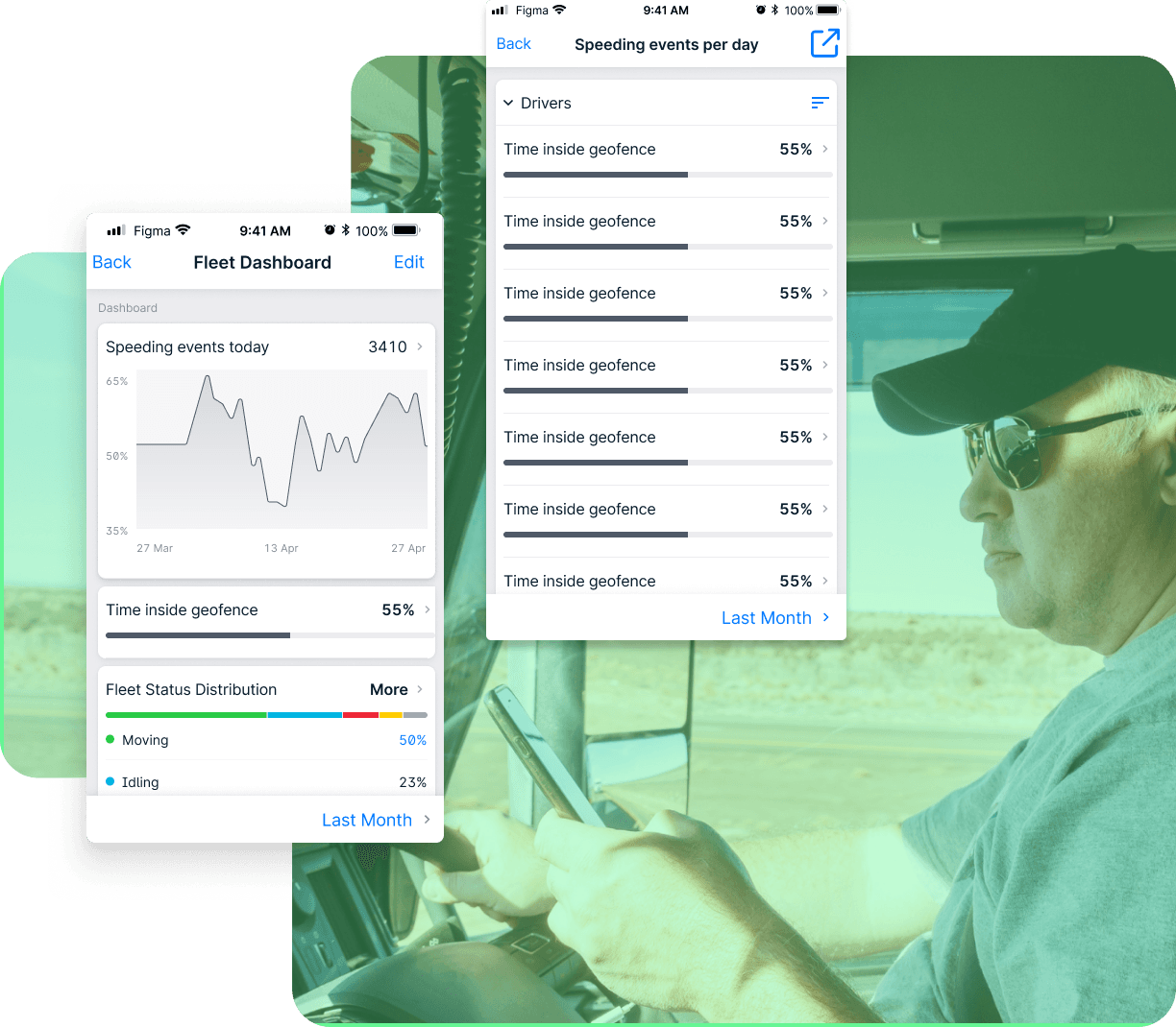
Once Dashboard is configured in GpsGate, data is ready in the Fleet app. Holistic fleet insight is now at your fingertips.
Notifications can be set up in GpsGate to automatically ping the Fleet app. So, fleet managers can notify their team when drivers have been speeding for, say, more than 10 times in the last hour.
Dashboard in the Fleet app provides customers with configured Widgets. Fleet managers can go a step further by tapping on a Widget to Drill Down. Doing this unveils more details, such as graphs indicating the distribution of moving vehicles, or a Top List showing the leading speeders in a given time frame.
Don’t have the Fleet App? Get it on the App Store or on Google Play!
Drill down on the details
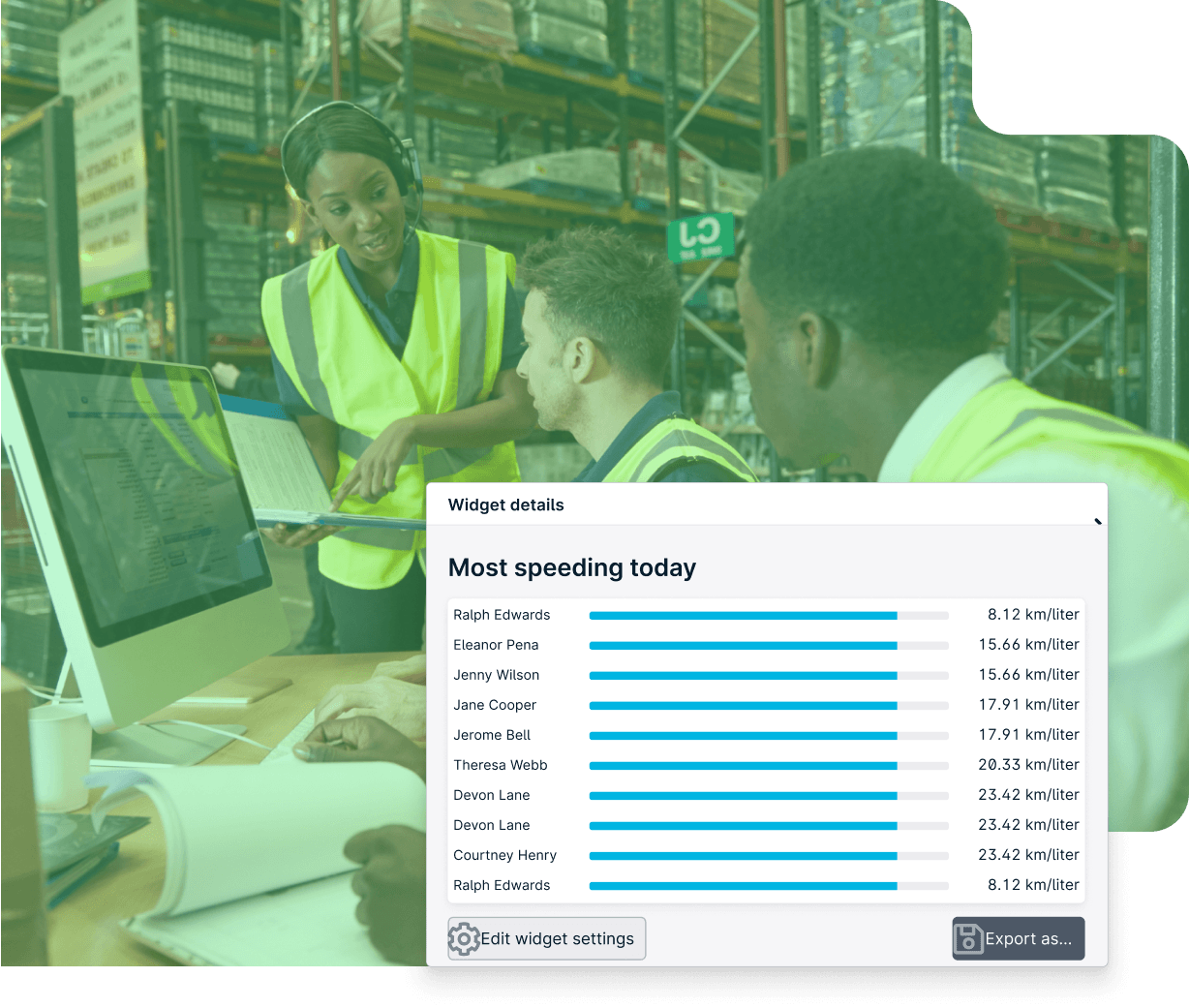
Glancing at the Widget gives a snapshot, Drilling Down provides the whole picture. Drilling Down produces more details from the KPIs occupying Widgets.
Drilling Down is simple. In GpsGate, click on the graph or chart displayed in the Widget. If you’re on the Fleet app, Drilling Down entails clicking on the title of the Widget. The end result? Top Lists, displaying repeat speeding offenders, or distribution graphs showing the time spent in or outside the garage.
Track down repeat offenders with Top Lists
Top Lists is one of the Dashboard components that we’re most excited about. To learn more about event frequency and total distance metrics, Drilling Down into a Widget produces a Top List.
So, what’s the big deal? You get insights into the fleet trends that stand out. How do you know if you have any repeat speed offenders in your team? Or which of your vehicles have covered the most distance in the last week? Top Lists. What can the information shown on the Top List lead to? More driver training, proactive vehicle maintenance, but most of all, better overall fleet control.
Consider Top Lists as your right hand in staying on top of KPIs.
Dashboard makes life for fleet managers easier
The feature empowers customers to visualize key insights and share that data with team members. KPIs are seamlessly visible and don’t require leaving the GpsGate platform to configure. These aspects ensure that time can be saved, and energy can be spent on pressing tasks, leaving manual data gathering behind. Dashboard is available on GpsGate Cloud, and can be enabled in the Store.
Test drive GpsGate Cloud today.
- acceptCookies - We use this cookie to remember if you have closed this window or not.
- country - We use this cookie to serve you country-specific data.
- gg_sessionId - This cookie helps us debug sign-up issues and general errors.
You can read more about cookies and privacy here.